Paper packaging printing has high requirements and novel design documents. There are also some packaging designers with limited printing knowledge and high printing difficulties, and there are many issues that need attention.
According to the experience of printing industry professionals, the following nine difficult-to-print colors and some pre-press designs need attention. For reference.
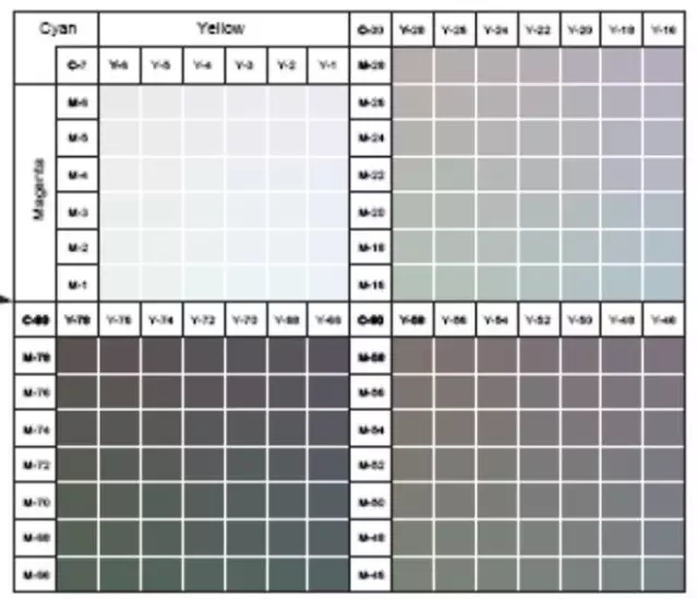
1. Gray balance. According to the experience of theory and production practice, the most difficult color to control in print is gray balance. Gray balance is that under certain printing suitability, the three primary color versions of yellow, magenta, and cyan are combined and printed at a certain dot ratio from light to dark to obtain different colors (white, light gray, gray, dark gray, and black), that is, There are many factors that affect the color of neutral gray. The amount of ink used, printing paper, full density, halftone dot area, overprint, and screen line number will have numerous effects on the gray balance. It is the most test of the machine's overprint accuracy and operator skill level.

2, 4-color screen and 3-color screen, do not print full color (recommended to use spot color printing).
3, people who do not understand printing design is the most difficult to print. Color is on the one hand, too much fine, very small print, etc.
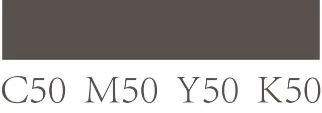
4, C = 50, M = 50, Y = 50, K = 50 large flat mesh, a little bit of inaccuracy, serious color cast.

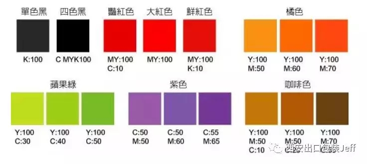
5. The text is four-color, that is, there are texts in the four colors in cmyk, especially the very small characters, which are difficult to put on, and the requirements for the paper teeth of the machine are extremely high. This is also a more common problem, so before printing, the designer must check the black text, especially the small print, in the publication file before output. Is it only available on the black version and should not appear on other three-color versions? If it appears, the quality of the printed product will be greatly reduced. When the RGB graphics are converted to CMYK graphics, the black text will definitely become four-color black. Unless otherwise specified, it must be handled.

6, there is a black background is not easy to handle. In order to achieve the effect, black ink can be printed with black ink or printed twice.
7. Superposition of several colored dots, especially over 70% dots. Specifically, dark brown, brown, dark green (flat screen, containing blue 70), dark blue, purple blue, and the like are difficult to find a balance on a printing machine because of the color difference, so they are all difficult to print.

8. In printing, generally full-printed things, full-color spot or large area, reversed characters, the same logo, and the same color block, generally difficult to follow the color, easy to produce color difference, ghosting, dirty, scratched Injury phenomenon.
9, small text in gold and silver. Professionals say that small texts are afraid of dry plate in batch process. These must be controlled in place. The printing plate must be wiped clean. The viscosity of the ink should be controlled around 14. Pay attention to dry plate.
In short, qualified print must meet:
1. Overprinting is accurate;
Second, the ink color is even;
Third, the outlets are full;
Fourth, water and ink balance;
Fifth, there are no printing faults on the printed products: such as dirty, scratches, flower printing, paste printing, etc .;
6. Strictly loyal to the original.
The article comes from the Internet and is for learning reference only.

